

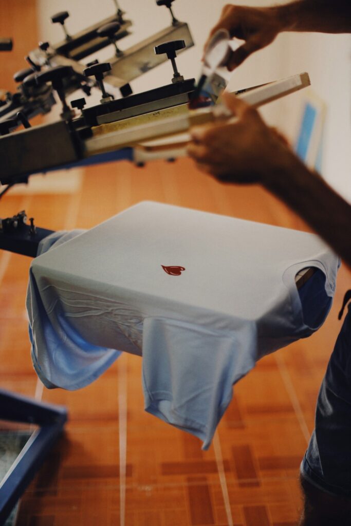
Choosing the right apparel color can make a design easier to read, more recognizable, and more visually balanced. The strongest choice is not always the brightest shirt or the darkest ink; it depends on contrast, fabric, lighting, garment style, and how the design will be used.
How does contrast make an apparel design more noticeable?
Contrast is the difference between the garment color and the printed or embroidered design. Higher contrast usually improves readability, especially from a distance or in changing light.
A simple starting point is to pair light and dark values:
- Black, navy, charcoal, or dark green garments usually support white, cream, yellow, light blue, or bright red designs.
- White, cream, light gray, or pale blue garments often work well with black, navy, dark green, burgundy, or deep purple artwork.
- Medium colors such as royal blue, red, orange, and forest green require more careful testing because some ink colors may blend into the fabric.
Color value matters more than color names. Two colors can be different hues but still have similar lightness, which makes them difficult to distinguish. For example, dark red lettering on a dark blue shirt may technically use different colors, but the design can appear muddy because both are relatively dark.
A useful test is to view the design in grayscale. If the artwork and garment nearly merge without color, the contrast may be too weak.
Should the shirt color match the design colors?
Usually, the garment should support the design rather than compete with it. Matching every color in the artwork can make a shirt feel coordinated, but exact matching is not required.
A practical approach is to choose one of three relationships:
Complementary contrast: Use colors opposite each other on the color wheel, such as blue with orange or purple with yellow. This creates energy and helps the artwork stand out.
Analogous harmony: Use nearby colors, such as blue, teal, and green. This creates a calmer appearance but may need a light outline or dark border for clarity.
Neutral foundation: Place colorful artwork on black, white, gray, cream, or another muted garment. Neutral apparel gives the design more visual attention and is often easier to wear repeatedly.
For a group shirt, a neutral or moderately saturated garment can also make the design easier to coordinate across different outfits. A highly vivid shirt may look appealing on its own but can limit when and where people feel comfortable wearing it.
Which apparel colors work well for Buffalo weather and local habits?
In Buffalo, NY, apparel is often used across several seasons, with heavier layers in cold weather and lighter garments during warmer months. Color selection can account for practical wear, not just appearance.
Dark garments are useful for outdoor activities, school events, workwear, and community gatherings because they tend to make small marks less visible. However, very dark fabric can show lint, salt residue, and light-colored fibers more readily, particularly during winter conditions.
Medium heathered colors can be forgiving for everyday use. Gray, muted blue, olive, and brown often hide minor wear better than solid white or very bright colors. These shades also work well with simple lettering and small graphics.
For summer events, lighter colors may feel more comfortable in direct sunlight because they absorb less heat than dark garments. White, cream, pale gray, and soft blue can be practical choices, although they may show stains more easily.
If the apparel will be worn under coats or layered with sweatshirts, consider how much of the design will remain visible. A high-contrast upper design may be more effective than a large graphic placed low on the garment and covered by a jacket.
How do fabric and garment texture affect color?
The same color can look different on smooth cotton, heathered fabric, fleece, performance material, and textured knits. Fabric texture scatters light and can make a color appear softer or less saturated.
Heathered garments contain blended fibers that create a speckled appearance. This can add visual interest, but small details may not appear as sharp as they would on a smooth, solid-color garment.
Fleece and heavier sweatshirts may absorb or soften the appearance of printed color. A design that looks vivid on a smooth shirt may appear slightly more subdued on thicker material.
Embroidery has its own color considerations. Thread has a raised, reflective surface, so a dark thread may appear brighter or more dimensional than a flat printed ink. Fine lettering and detailed images may also need stronger color separation to remain readable once stitched.
For designs with thin lines, small text, or intricate symbols, color contrast should be evaluated together with the fabric texture. A high-contrast color combination cannot fully correct for details that are too small or crowded.
What colors are easiest to read from a distance?
For signs, team apparel, volunteer shirts, school groups, and event clothing, readability from several feet away is often more important than subtle color harmony.
These combinations generally provide strong visibility:
- Black lettering on white, cream, or light gray
- White lettering on black, navy, or dark green
- Yellow lettering on black or deep navy
- Dark blue lettering on white or pale gray
- Red lettering with a light outline on a dark garment
Bright yellow can be highly visible, but it may need a dark outline or border to prevent the edges from disappearing. Red and green can also present challenges for some viewers with color-vision differences, especially when used together without differences in lightness.
Avoid relying only on color to communicate information. If a design identifies teams, roles, or categories, adding text, symbols, patterns, or clearly different light-dark values can make the apparel more accessible.
How many colors should an apparel design use?
There is no universal limit, but simpler palettes are usually easier to read and reproduce consistently. Two or three main colors often provide enough contrast and visual character without making the design feel crowded.
A basic palette can include:
- A garment color
- A primary design color
- A secondary accent or outline

An outline can separate the design from the fabric and help lettering remain legible. For example, light lettering with a dark border can work on a medium-colored shirt, while dark lettering with a light border can create separation on a brighter garment.
Using too many similar colors can make an image look flat. Using too many highly saturated colors can make it feel visually noisy. If the artwork already contains many colors, a neutral garment may give the overall design more balance.
What is the best way to preview colors before choosing apparel?
Digital previews are useful, but they should not be treated as exact predictions. Screens display light, while fabric absorbs and reflects it. A color shown on a monitor may appear brighter, cooler, warmer, or more saturated on an actual garment.
Before making a final choice, review the design in several conditions:
- Bright indoor lighting
- Dim indoor lighting
- Outdoor daylight
- A grayscale view
- A small-size view that shows how the design reads from a distance
It also helps to look at the design as a thumbnail. If the main shape, lettering, or symbol disappears when viewed small, the colors or layout may need stronger separation.
For an apparel design intended for winter gatherings, outdoor activities, or layered clothing, previewing it against a dark coat or sweatshirt can reveal whether the artwork will remain visible in everyday use.
What common color mistakes should be avoided?
The most frequent problem is choosing colors based only on how attractive they look separately. Colors must be judged as a combination, including their relationship to fabric and lighting.
Other common mistakes include:
- Using dark ink on a dark garment without an outline
- Placing pale yellow or light gray on a white shirt
- Assuming screen colors will exactly match fabric colors
- Choosing a heathered garment for very fine artwork
- Using several saturated colors with no neutral element
- Ignoring how the design looks from a distance
- Selecting a color that hides important text or numbers
The best apparel color choice balances visibility, comfort, wearability, and the character of the design. A bold graphic may call for a restrained garment, while a simple wordmark may benefit from a richer shirt color. Testing contrast, fabric, and lighting together leads to a more dependable result than choosing colors from a screen alone.